
Fashion & History 15.04.2025
31.05.2021
1970sglobal fashionItalian stylelogomaniaSportswear
Where can we start to tell the story of Fila? From the iconic logo, of course! directly from the archive, here is the first voice of our new member.
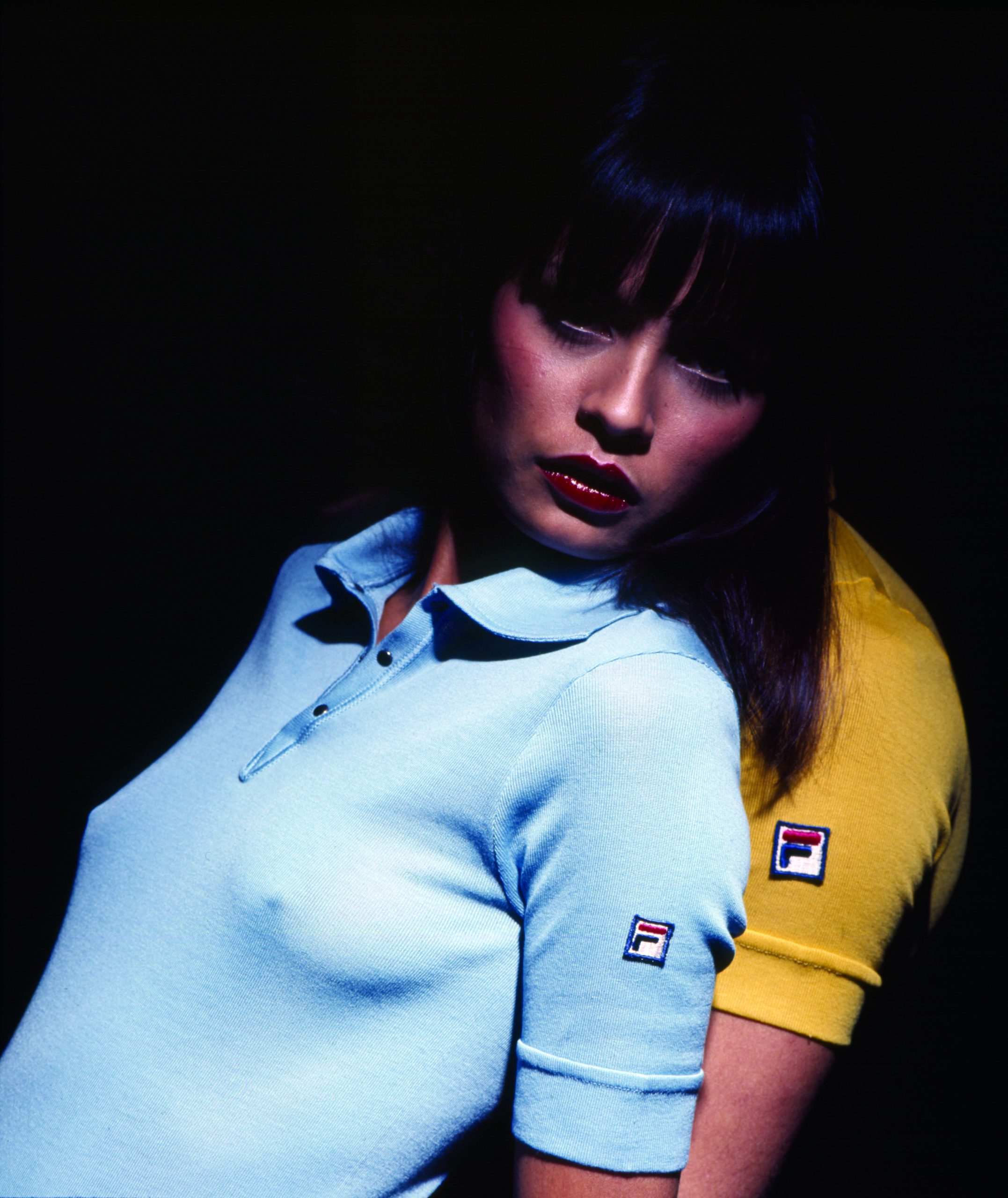
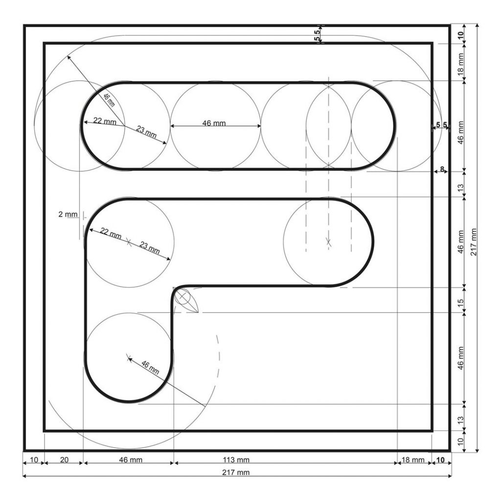
The uniqueness of a brand is often stated by the logo with which the brand becomes immediately identifiable. In the case of FILA SPORT, the logo developed as the transformation of a typeface into an icon – and its history is well saved by the objects preserved in the archive. The F-BOX logo – this is the name it came to be recognised with – was designed by advertising genius Sergio Privitera in 1973, a year before the launch of Fila’s White Line tennis line. The logo came out of a study that started from the historical logo of Fila and turned it into a symbol of its time and, it would become clearer and clearer, for the future.
Rounded and elongated shapes, one navy blue and one fiery red, stand out against a white background, all of this framed by a black square: a simple, immediate image, which is actually the result of an in-depth study on the balance between different geometrical shapes. Privitera is a cultured figure, close to the artistic languages of his time: in the seventies his gaze inevitably turns to Pop Art, the avant-garde artistic movement originated in the USA, which called the human being into question critically reflection on daily life and consumer products. However, the main reference for the advertiser is not Andy Warhol, but indeed Robert Indiana, an artist who went down in history thanks to paintings, serigraphs and sculptures that transformed the written word and its flatness into a refined, tridimensional, language.
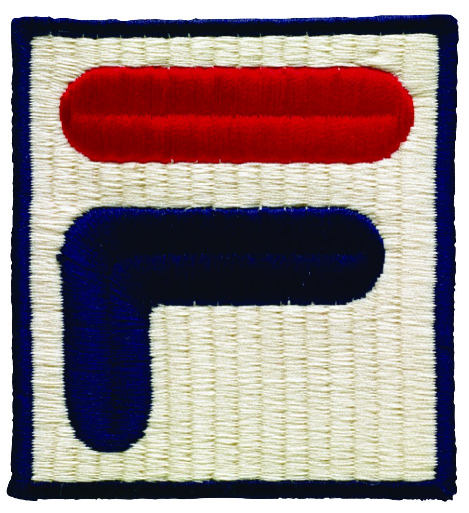
After 48 years, the F-BOX is such an impactful symbol that it has not undergone any changes: on the contrary, its evocative power remains a point of reference for several generations, who see it as a stylistic and cultural benchmark.
Fashion & History 15.04.2025
Fashion & History 29.12.2020
Fashion & History 21.12.2020
EFHA World 26.11.2020